On August 13, 2019, the Fusion 360 Engineers pushed out a new update. Most Fusion 360 updates include several bug fixes and minor feature enhancements. This one, however, includes an update that completely rethinks how users work in Fusion 360.
Adapting to major changes in software can be frustrating for both experienced and new users – especially when it affects their efficiency.
I’m here to help bridge the gap between the old user interface and the new user interface. I’ll cover all of the significant changes that you should be aware of including changes to terminology, iconography, discoverability, and more.
Overall, the changes affect Fusion 360’s main toolbar user interface, where users browse and activate new features.
Table of Contents:
- Switching back to the old UI
- Iconography updates
- Workspace updates
- Tabs (Design Workspace)
- Contextual Tabs
- Shortcuts Box
- Right-Click Menu
- Add-ins and Scripts
Switching Back to the Old UI
First, you may be wondering, “can I switch back to the old UI?“
The answer is yes and no. You’ll be able to switch back to the “Old Toolbar UI” for a limited amount of time. The folks at Autodesk are stating that the old toolbar user interface will be available for approximately 2 update cycles (although I wouldn’t be surprised if it’s available for 3 or 4 update cycles).
UPDATE: The ability to switch back to the old UI is no longer available.
Switching back to the older toolbar can be useful for users that are trying to follow a tutorial video or for those who are experiencing bugs with the new toolbar (report any bugs you experience, please).
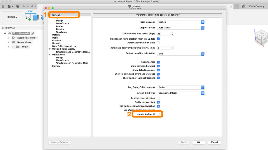
To switch back to the older toolbar, select username > preferences > general tab > check “Use old toolbar UI” > hit the “Apply” button and then restart your copy of Fusion 360 to get the changes to take effect.
Iconography Updates
You’ll notice that (almost) all of the icons used throughout Fusion 360 have been updated. This is part of a larger plan to make the icons more unified across all Autodesk products. As in, these icons will also be used in Autodesk Inventor and other Autodesk products.
Old Fusion 360 Toolbar Icons

New Fusion 360 Toolbar Icons

Key changes with these icon updates:
- The “Create Sketch” icon now has a green plus symbol and no longer includes a pencil icon
- The icons no longer have a small drop shadow
- Most icons no longer have their solid black border around them
- Shades of blue are used more frequently throughout the icons
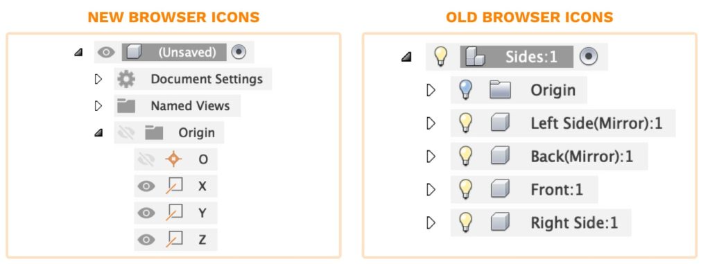
Previously, the Fusion 360 Browser used a lightbulb icon to show the visibility of objects. Originally, this was depicted by a lightbulb being yellow if it was visible, while a blue lightbulb meant the object was hidden or “turned off”.
Now, with the update, you’ll see the visibility icons are represented with an eyeball icon. The eyeball is dark gray if the object is turned on. If the object is turned off then the eyeball icon is light gray and also has a slash through it.
Workspace Updates
The new toolbar improves the organization and hierarchy of tools. These updates will take a little bit of time to get used to. However, eventually, they’ll make working in Fusion 360 much more efficient and intentional.
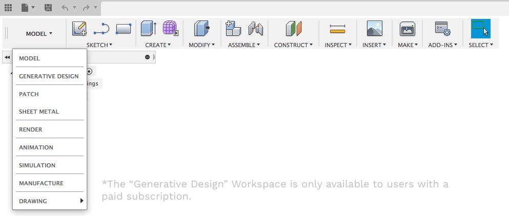
The old toolbar had 9 workspaces:
- Model
- Generative Design
- Patch
- Sheet Metal
- Render
- Animation
- Simulation
- Manufacture (previously called CAM)
- Drawing
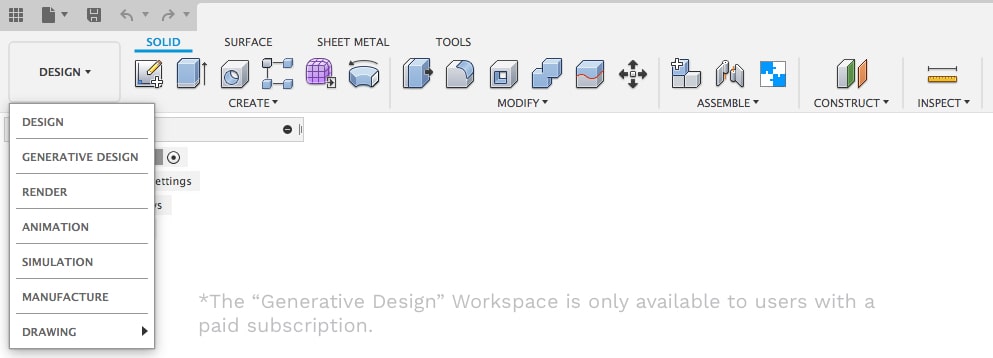
The new toolbar has only 7 workspaces:
- Design (previously called Model)
- Generative Design
- Render
- Animation
- Simulation
- Manufacture
- Drawing
Note: You won’t see the “Generative Design” Workspace if you’re on the Education or Startup/Hobbyists license.
Tabs (Design Workspace)
The new UI includes the addition of tabs within workspaces. The Model Workspace has been renamed the Design Workspace. You’ll see there are four tabs within the Design Workspace.
Solid Tab
The Solid tab includes all of the solid (parametric) modeling tools that were formerly in the Model workspace.

Surface Tab
The Surface tab includes all of the surface modeling tools. These features used to be located in the “Patch Workspace”.

Sheet Metal Tab
The Sheet Metal tab includes all of the sheet metal tools that were formerly in the “Sheet Metal Workspace”.

Tools Tab
The Tools tab includes all of the features that don’t correlate specifically to one type of modeling. Within the Tools tab, you’ll find the 3D Print dialog, add-ins, and scripts, as well as your inspect and analysis tools.

Contextual Tabs
One of the largest changes with this update is the new addition of contextual tabs.
The idea with the contextual tabs is that they take away all of the clutter or features that you won’t be using in your current state, which allows for more room of features that you may need. This also gives you more room to customize your toolbars.
Sketch Contextual Tab
One of the big changes is the fact that you will no longer see the Sketch dropdown list while you’re in the Design workspace. To enter the sketch environment (now the sketch contextual tab) you’ll have to select “Create Sketch” or use one of the sketch shortcuts with the shortcut keys or the shortcut box.
When you’re in the sketch tab or the sketch environment, you’ll see that the “Create” dropdown list now includes all of the sketch geometry. This was formerly labeled the “Sketch” dropdown list.
The nicest thing about this improvement is that the toolbar has much more room to display the sketching related features.
The other big change with this is the fact that they’ve decided to remove the sketch constraints from the sketch palette. All of the sketch constraints will now appear in the toolbar.
Sketch constraints are not only a little bit easier to access up in the toolbar, but you can now also apply custom keyboard shortcuts to them, which was something that was not available when the constraints were in the sketch palette.
The Sketch contextual tab will remain “active” (highlighted in blue) until you do one of two things. You either have to click the “Finish Sketch” button in the sketch tab, which was previously labeled “Stop Sketch”. Otherwise, you’ll have to activate one of the modeling commands, which will then automatically close the sketch tab.

Mesh Contextual Tab
If you select the “Create” dropdown list under the “Solid” tab, you’ll see that you can select the “Create Mesh” option. This will put you in the Mesh contextual tab with all of the relevant Mesh tools.
Similar to the others, this used to be its own workspace but it’s now simply a contextual tab that’s within the Design workspace. Hopefully, you can start to see how this design workspace encompasses the variety of modeling tools all into one workspace.
Note: The Mesh Workspace is still in preview and must be activated in your preferences dialog.

Direct Modeling (Base) Contextual Tab
Select the Solid Tab, and then the “create” dropdown menu. From there, you can select the “create base feature” option near the bottom of the list. This will place you into the “direct editing” mode where the actions you take are not recorded in the timeline below.
In this “base” mode we have the “Base feature solid” tab that includes all of the solid modeling tools and we have the “Base Feature Surface” that includes all of the surface modeling tools. Notice, the sheet metal and tools tabs won’t appear while in “base” mode.

Shortcuts
Another critical change with this new UI update is the shortcuts box.
Hit the shortcut letter “S” to activate the shortcuts box. Previously, this box only displayed the tools relevant to your workspace, which is somewhat still the case. However, you’ll notice that while in the Design workspace, you can now see shortcuts for all of the available contextual tabs within the Design workspace.
With that said, these shortcuts boxes are still tied to certain contextual tabs. For example, if enter the “form” tab and hit the keyboard shortcut letter “S,” you’ll see that it includes the “Form Shortcuts.”
In summary, the “Design Workspace” shortcuts box will include the solid, surface, sheet metal, and tools shortcuts. While the other contextual tabs will still have their own unique shortcuts boxes.

Right-Click Menu
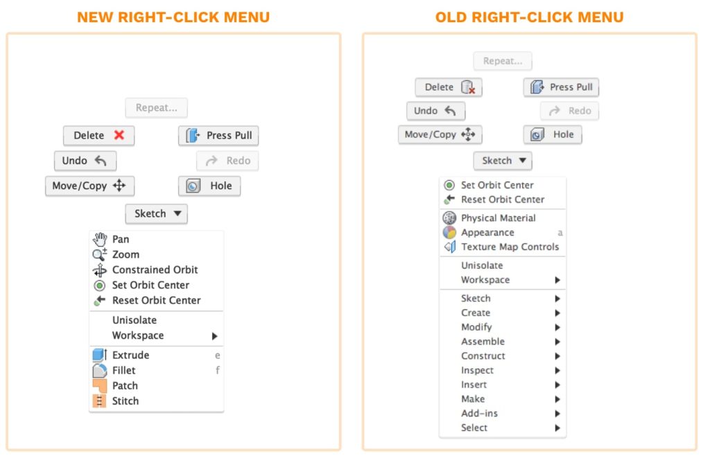
Another small change, that is still fairly critical, would be the right-click menu. If you right-click you’ll see that the shortcuts you’ve saved to the shortcuts box (discussed above) now appear here as well. This replaces the old right-click menu that used to include all of the standard dropdown menus.
Add-Ins and Scripts
One of the largest changes to be aware of is that this new layout is going to affect several add-ins and scripts. Many of them will no longer function properly until they’re updated by their respective authors.
With this new update, you’ll want to take the time to reinstall all of your add-ins or scripts as updates become available. If you find that your add-in or script isn’t working, then you’ll want to contact the author to let them know. There’s a new API for the contextual tabs, which in many cases, causes the plugins to be buggy or simply not work altogether.

Transcript:
By the end of this tutorial, you’ll know the most critical changes to be aware of while adjusting to Fusion 360s new user interface. We’ll take a look at some changes to terminology, iconography, discoverability, and more. I’ll even show you how to switch back to the old UI, while it’s still available.
I’ll be listing all of these critical changes on my website so you can reference them as you adjust to the new update. Check it out at ProductDesignOnline.com/14… that’s ProductDesignOnline.com/14 [one – four].
First, before we discuss all of these changes, let’s take a look at how to switch back to the Old UI. The ability to switch back won’t always be an option, but it’ll be available for the next couple of update cycles. Switching back to the old UI can be helpful if you’re following tutorial videos with the older UI, or if you’re experiencing bugs with the new UI.
To switch back, simply select your username in the upper-righthand corner, then select your preferences option. Within the preferences dialog, you’ll want to be on the general tab. Then, if you look at the very bottom of the list, you’ll see there is an option to “Use old toolbar UI”. If you check this option and hit apply, you’ll be prompted to restart Fusion 360 to get these changes to take effect.
I’ll hit “not now” and let’s dive right into looking at these critical changes.
First and foremost, you’ll notice that all of the icons have been updated to a newer look. Some of the icons haven’t changed much at all, while others look quite a bit different. Overall, these icon changes are part of a larger Autodesk push to make their products more unified. As in, these icons will also be used in Autodesk Inventor and other Autodesk products.
Let’s take a moment to compare these icons. I’ll put the new ones on the bottom and the old ones at the top of the screen.
You’ll see that one of the biggest differences is that these new icons no longer have a drop shadow and they’ve removed the outline or dark border.
I find these newer icons harder to read. Particularly because of that border being removed. You’ll see that many of the icons, such as the shell command, have a more flat appearance as the softer colors converge together. My concern is that if it’s harder to discern at this larger size in the toolbar, then they’ll be even harder to recognize at the smaller size in the dropdown list or when the icons appear down below in our timeline.
I’m curious as to what all of you think, as I think it’s important that we voice our opinions to help the folks at Autodesk continue to make improvements. Go ahead and pause this video and take a moment to comment below whether you think these new icons are easier or harder to interpret.
Before moving on, I just want to point out two more things with icons. First, you’ll notice the “Create Sketch” icon has changed quite a bit. It no longer includes a pencil, and it now appears to be more of a shape that was sketched out.
My concern with this one is that it no longer stands out within the “Create” dropdown list. I also think that it doesn’t mimic the reality of sketch profiles. Assuming that these are supposed to be closed profiles, it may be better overall if they add the orange background highlight to the icon.
Lastly, I want to point out that the lightbulb icon in the Fusion 360 browser has been changed to an eyeball icon. If I click the eyeball icon, you’ll see that it now appears to have a slash through it when it is turned off.
This change has been a hot topic on the forum and in some of the Facebook groups, as many users pointed out it’s much harder to recognize when an object is turned on or off when compared with the lightbulb colors. If you guys agree, let me know in the comments down below!
The next most critical change would be the workspaces menu. If I click on the workspace dropdown in the upper left-hand corner, you’ll notice there are fewer workspaces. The model workspace has been renamed the “Design” workspace.
You’ll also notice that the Patch workspace and the sheet metal workspace no longer appear in the workspace dropdown list, as they’ve been turned into tabs that are located within the Design workspace.
The idea with these tabs is that they’re more contextual based on what environment you’re in.
The “Solid” tab hosts all of the former modeling tools.
The “Patch Workspace” has been renamed to “Surface” to better represent the surface modeling tools.
The “Sheet Metal” workspace has been moved into this “Sheet Metal” tab.
Finally, this “Tools” tab hosts all the other functionality that doesn’t correlate directly to one of the workspaces or types of modeling. You’ll see that the tools tab lets you access the “3D Print” function, your “add-ins or scripts” and the various inspection and analysis tools.
One other big change with this new tabular format is that the Sculpt environment has not only been renamed to “Form” but it has also become a contextual tab as well. As in, you’ll no longer have “Sculpt” appear in the workspace dropdown list once you select the “create form” icon.
I’ll select the “Solid” modeling tab and then I’ll select the “Create Form” button. You’ll see that puts us in the “Form” contextual tab, as we now have all of the “form” or “sculpt” functionality in the toolbar. The idea with the contextual tabs is that they take away all of the clutter or features that you won’t be using in your current state, which allows for more room of features that you may need. This also gives you more room to customize your toolbars.
To re-enter the model workspace, you’ll still have to hit the “Finish Form” button, they’ve simply just re-styled its appearance.
One of the other big changes is the fact that you will no longer see the Sketch dropdown list while you’re in the Design workspace. To enter the sketch environment you’ll have to select “Create Sketch” or use one of the sketch keyboard shortcuts.
Watch what happens as I hit the keyboard shortcut letter “L,” as in Lima, to activate the line command.
Nothing appears to happen at first, as we are still required to select an origin plane or the face of a working model to start the sketch on. After selecting a plane or face, you’ll see that the toolbar now becomes the Sketch contextual tab.
Now that we’re in the sketch tab or the sketch environment, you’ll see that the “Create” dropdown list now includes all of the sketch geometry. This was formerly labeled the “Sketch” dropdown list.
The nicest thing about this improvement is that the toolbar has much more room to display the sketching related features.
The other big change with this is the fact that they’ve decided to remove the sketch constraints from the sketch palette. All of the sketch constraints will now appear in the toolbar.
They’re not only a little bit easier to access up in the toolbar, but we can now also apply custom keyboard shortcuts to them, which was something that was not available when the constraints were in the sketch palette.
Let’s pretend that I’m just starting a new model and I’m going to sketch out a circle on my active sketch plane.
I then decided that I need to extrude this circle. If I select the “Solid” tab to see all of the modeling tools, you’ll notice that the sketch tab still appears in the toolbar and it is highlighted in blue. This is to remind you that you’re still in an active sketch environment.
You’ll remain in that sketch until you do one of two things. You either have to click the “Finish Sketch” button in the sketch tab, which was previously labeled “Stop Sketch”. Otherwise, you’ll have to activate one of the modeling commands.
If I select the Solid tab and then select the Extrude icon, you’ll see the sketch environment automatically closes.
I also want to point out that the sketch icon in the timeline below has a pencil in it, although it may be hard to see that small…and it looks a little bit different than the “create sketch” icon.
We’ve seen the Form and Sketch contextual tabs, so let’s take a look at a few others that are new.
If I select the Create dropdown list under the “Solid” tab, you’ll see that I can select the “Create Mesh” option. This will put me in the Mesh contextual tab with all of the relevant mesh tools. Similar to the others, this used to be its own workspace but it’s now simply a contextual tab that’s within the Design workspace. So you can start to see how this design workspace encompasses the variety of modeling tools all into one workspace.
It’s also important to note that these mesh tools are still in preview mode and they’re only going to show up if you have the “mesh preview” turned on in your preferences.
I’ll select the “Finish Mesh” button in the toolbar.
This time, let’s take a look at what happens when we want to enter the direct editing mode.
I’ll select the Solid Tab, and then the “create” dropdown menu. From here, I’ll select the “create base feature” at the bottom of the list. This will place us into the direct editing mode where the actions we take are not recorded in the timeline below.
You’ll notice that we now have different contextual tabs. In this “base” mode we have the “Base feature solid” tab that includes all of the solid modeling tools and we have the “Base Feature Surface” that includes all of the surface modeling tools. The sheet metal and tools tabs won’t appear while in “base” mode.
Like all tabs, we’ll have to click the “Finish” button to leave the contextual environment.
Another critical change with this new UI update is the shortcuts box.
I’ll hit the keyboard shortcut letter “S,” as in Sierra, to activate the shortcuts box. Previously, this box only displayed the tools relevant to your workspace…which is somewhat still the case. However, you’ll notice that while I’m in the Design workspace, I can now see shortcuts for all of the available contextual tabs within the design workspace.
With that said, these shortcuts boxes are still tied to certain contextual tabs. For example, if I re-enter the form tab and hit the keyboard shortcut letter “S” once again, you’ll see that it includes the “Form Shortcuts.”
So to summarize this, the “Design Workspace” shortcuts box will include the solid, surface, sheet metal, and tools shortcuts. While the other contextual tabs will still have their own respective shortcuts box.
Another small change, that is still fairly critical, would be the right-click menu. If I right-click you’ll see that the shortcuts I’ve saved to the shortcuts box now appear here as well. This replaces the old version that used to include all of the dropdown menus.
Last but not least, probably one of the largest changes to be aware of is that this new layout is going to affect several add-ins and scripts. Many of them will no longer function properly until they’re updated by their respective authors.
With this new update, you’ll want to take the time to reinstall all of your add-ins or scripts as updates become available. If you find that you’re add-in or script isn’t working, then you’ll want to contact the author to let them know. There’s a new API for the contextual tabs, which in many cases, causes the plugins to be buggy or simply not work altogether.
Last but not least, I’m going to be delivering some feedback about this new UI to my contacts at Autodesk on September 1st and I would like your help and input! Take some time to play around with these new changes, or think about them as you’re working on your projects the next week or so and then comment them on this video. Comment your thoughts even if someone else has already commented on the same topic, as this will also help me gauge which improvements are most critical. You can comment on what you like and what you dislike as this will help them better improve the UI for future updates.
As always, I truly appreciate you taking the time to watch this tutorial. Click that thumbs up icon if you want more high-quality content and click on that playlist in the lower right-hand corner to watch more Fusion 360 tutorials.
To be a part of the Product Design Online community, be sure to subscribe and check us out on Patreon by clicking that Patreon logo right now.
Leave a Reply