Transcript:
By the end of this tutorial, you’ll be able to preview Fusion 360’s new User Interface design.
To turn on the preview of the new UI all you have to do is turn one setting on… Click on your username in the upper righthand corner and then selectThe selection mode controls how objects are select when you drag in the canvas. More “Preferences” from the dropdown list. This brings up all the different settings and preferences that you can define.
If you look atRe-arranges screen to look at selected object. More the list on the left side of the dialog, you’ll notice at the very bottom it says “preview.” I’ll go ahead and click on the preview option.
Now before we switch on the new UI it’s important to note that all these options that are available to preview are still in the conceptual stage. This means that you can turn each one of them on and off as you please, but take this as a forewarning that it may or may not cause performance issues.
Near the bottom of the list, you’ll notice it says “UI Preview.” To turn on and preview the new UI all we have to do is make sure the check boxCreates a solid box. Select a plane, draw a rectangle then specify the height of the box. More is selected and then you’ll have to hit the apply button…. And you’ll notice it warns you that you’ll have to restart Fusion 360 in order for the changes to be applied.
I’ll click okay to close this warning… and I’ll click okay to close this dialog box.
Now I’ll go ahead and close Fusion 360… and I’ll click on it again to reopen it…
You may get some error messages from add-ins or scripts not working properly… so you’ll want to be sure to look into those… or understand that you’ll have to turn the preview off in order to use them again.
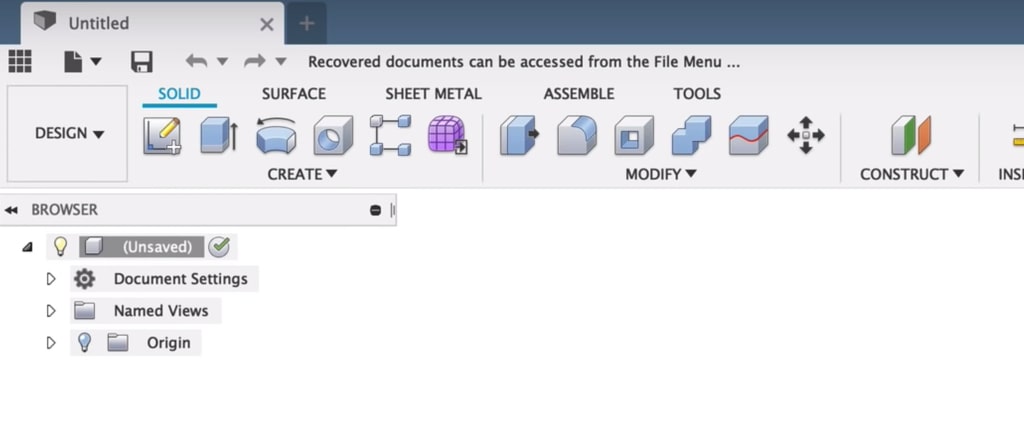
Let’s take a look at some of the new UI features, including some word changes and layout changes.
The first thing you’ll notice is that the model workspaceCreates mechanical designs that contain mostly prismatic geometry. Access commands to create solid bodies. More has become the Design workspace…and they changed this wording because the “design workspace” now encompasses the sheet metal and the Surface modeling or Patch workspace commands.
So you’ll notice across the toolbarUse the Toolbar to select the workspace you want to work in, and the tool you want to use in the workspace selected. More, these commands are now nested under tabs…and the general idea is to make it easier to access commands so you no longer have to switch workspaces. They’re also trying to group commands according to use, so you’ll notice some commands will show up under multiple tabs.
Another big change with this UI Preview is the sketch environment. If I create a new sketch, you’ll notice all the sketch related commands take over the toolbar…and a sketch tab now appears. The constraints have also been moved from the Sketch dialog box to the toolbar. You can also switch back and forth between the other tabs while still in the sketch environment.
Overall, the idea of contextual tabs is to put the related features in front of you…hopefully making your workflow more efficient. Now obviously this is still under construction and they’re testing how commands should be grouped.
A few months ago the Fusion engineers also pushed out an update for custom keyboard shortcuts. Some of the future versions of Fusion 360 will continue to have more shortcut control, including those for settings and options that aren’t modeling commands.
The team also mentioned that they will be working on a night mode or Dark UI theme, and some other UI enhancement updates.
If you do take the time to play around with this new UI preview then I’d love to hear what your thoughts are. Be sure to drop a comment below and let me know what you love and hate about it.

Leave a Reply